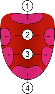
One
image which unfortunately stuck with me from my time in elementary
school was the “Tongue Map” from health class. For the
uninitiated, the tongue map is a graphical representation of where
the different “flavor receptors” are located on your tongue. This
image sections of bitterness, sweetness, saltiness, and sourness, and
clearly illustrates the idea that humans use one part of their tongue
to experience a specific flavor. However, the science behind this
illustration that has so captured the publics imagination is false.
Apparently the confusion began as a result
of
a study performed in 1901 by David
P Hänig. His study revealed that certain parts of the tongue were
more
sensitive
than others to specific flavors such as salt or umami. While this
element was scientifically sound, the diagram he put out to accompany
his findings seemed to highlight different regions of the tongue as
responsible
for
handling specific flavors. Additionally, the regions demonstrated in
the graphic were not reinforced by empirical measurements. From this
discrepancy, many incorrect assumptions have been made about the way
human beings understand our sense of taste. I wanted to examine this
phenomena more closely and research about what the origins of this
popular myth were. Additionally, having read Savoring
Disgust
and now considering all the gross tastes humans relish, the tongue
map makes even less sense. I have not seen in my research a single
variation that mentions unpleasant tastes, such as those associated
with mold or decay.
Photo Credit:
https://public-media.smithsonianmag.com/filer/54/f1/54f11932-0955-4f6f-86df-63b13d8f65fc/image-20150703-11301-1v6p8ii.png, https://www.smithsonianmag.com/science-nature/neat-and-tidy-map-tastes-tongue-you-learned-school-all-wrong-180963407/
Article:
https://www.smithsonianmag.com/science-nature/neat-and-tidy-map-tastes-tongue-you-learned-school-all-wrong-180963407/


Comments
Post a Comment